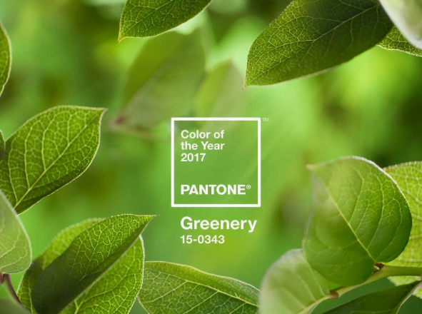
Nature lovers are celebrating Pantone’s Color pick for 2017.
It’s green. (Greenery #15-0343)
Pantone has been choosing a “color of the year” since 2000. Their Color of the Year selection is intended to be a symbolic choice that provides a “color snapshot of what we see taking place in our global culture that serves as an expression of a mood and an attitude.” That color choice has historically gone on to influence everything from interior design to even food and travel.
Described as nature’s neutral, Pantone says Greenery “is a versatile, trans-seasonal shade that lends itself to many color combinations.” Pantone demonstrates the color’s flexibility by pairing it with 10 color palettes on the site – brights, darker shades, even metallics.
Why Greenery?
Greenery is seen as a breath of fresh air: a rejuvenating yellow-green that reminds you of those fresh, early days of Spring, and symbolic of those feelings of “Renew. Revive. Restore.” The more submerged people are in modern life, the greater their innate craving to immerse themselves in the physical beauty and inherent unity of the natural world. This shift is reflected by the proliferation of all things expressive of Greenery in daily lives through urban planning, architecture, lifestyle and design choices globally.
And perhaps it’s this very sense of revitalization, the connection to the earth, and the growing awareness of our impact on it that makes Pantone’s choice so poignant. “The more submerged people are in modern life, the greater their innate craving to immerse themselves in the physical beauty and inherent unity of the natural world. This shift is reflected by the proliferation of all things expressive of Greenery in daily lives through urban planning, architecture, lifestyle and design choices globally.”

This particular hue in color choice is different: it’s not “green with envy” Emerald which was meant to be evocative of luxury. No, this choice brings a freshness found in the beauty of minimalism. Laurie Pressman, the Pantone Color Institute’s vice president said the color choice was inspired by fashion designer Vivienne Westwood’s philosophy: “Buy less, choose well, make it last.”
“At New York Fashion Week, the designers were explaining how we live in this modern world where technology will always exist, but there’s this need to turn to design to go to the opposite side, to Nature,” Pressman said.
Leave a Reply
You must be logged in to post a comment.